Identifying a Critical Flaw Before Development
For Discite (start up)

The Problem
The clients had a concept for a dapp but were unsure if it would appeal to the audience. We needed to confirm this before seeking investors to avoid wasting time and resources.
After validating the project's significance and engaging with potential users, I developed the application. The last step involved identifying usability issues before embarking on developing our 1.0 version.
The Outcome
The first tests validated the concept, confirming it resonates with users and meets their needs before starting the project. The outcomes of this first test:
-
Minimized Risk: Reduced the chance of developing a product that might not be used.
-
Informed Decisions: Enabled well-informed choices regarding the product's features, design, and direction.
-
Enhanced Market Fit: Improved the likelihood of market success by ensuring the product aligns with user needs.
-
Boosted Investor Confidence: Increased the likelihood of securing funding by demonstrating a validated concept to potential investors.
The second phase of tests was crucial for uncovering usability issues and played a key role in identifying a critical flaw in one of the main tasks (flows), allowing for necessary improvements before app development.
-
Avoided Rework: Detecting critical flaws before full-scale development prevents costly rework and redesign, saving both time and resources.
-
Enhanced Usability: Identifying and addressing usability issues early ensures a smoother user experience, which can lead to higher user satisfaction.
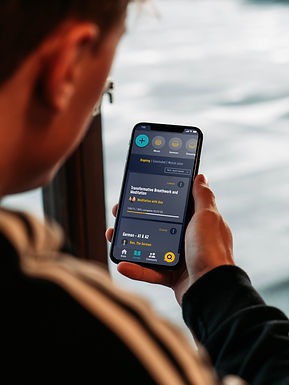
What is Discite?
Discite is the future of knowledge sharing. In this decentralized app, everyone can teach and everyone can learn. Learners purchase courses and lessons using the application token (DCE), receive extra exercises and feedback from content creators (tutors), conquer NFT certificates when completing courses, and can earn token rewards if they complete their study goals.
1. DISCOVER
2. DEFINE
3. DESIGN
Ideation
What sets the product apart?
Do people want this product?
Who are the potential users?
Research (1 and 2)
Ideation
Personas +
Empathy +
Information
Architecture +
User flow
Prototyping
Medium Fi +
High Fi +
Design System
4. TEST
5. ITERATE
Research
Usability Test
Adjustments
Based on the Usability tests
1|Ideation
(1/7)
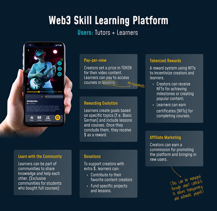
CONCEPT DEFINITION WORKSHOP
I facilitated an ideation workshop with the founders (clients) to refine key aspects of the concept and generate material for the next phases of the project.

2|Research 1 and 2
(2/7)
Do people want this product?
To take advantage of this opportunity to contact the participants, I decided to conduct two research studies with each of them. One to validate the product's concept and the other to gain an in-depth understanding of our users.
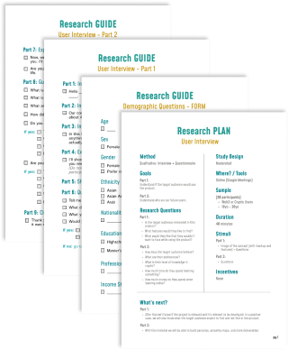
Method
Qualitative: Interview + Questionnaire
Goals
Part 1:
Understand if the target audience would use the product.
Part 2:
• How does the target audience behave?
• What is their level of knowledge in crypto?
• How much time do they spend learning something?
Sample
• 30 participants
• Web3 or Crypto Users
• 18 - 30 y.o.
How?
Part 1:
• An image with the product concept is shown,
which includes a mockup and product features.
• Followed by an interview to learn what the
participants think about the product and if they
would use it.

Part 2:
• Demographic questionnaire.
• Followed by an interview with open-ended questions
to know who are the potential users.
Milena (researcher) during the interview with a participant
Results
Validating the concept through user insights revealed key needs and reactions, allowing us to refine our product requirements and reduce risks, ensuring market fit and enhancing investor confidence.
Insights from participant feedback during the concept validation phase highlighted crucial user needs and preferences, guiding us to tailor the product effectively and address potential issues early.
"It’s cool having no censorship on what is being taught. But, like, what if someone tries to teach sketchy stuff?"
“So, this means that both learners and creators can benefit from reduced transaction costs. It boosts the value of each lesson."
"Communities and forums are rad – they make you feel part of something. Plus, they're like study buddies that got your back through the learning grind."
“Nice! Rock your courses, and you score some tokens. It's like a reward for being a smarty pants.”
“This allows for creative and flexible ways for creators to generate income.”
“The app makes it super easy for anyone, anywhere to grab lessons and pay up, no fuss with old-school banks or weird money exchanges."
3|UX Design
(3/7)
EMPATHY MAP
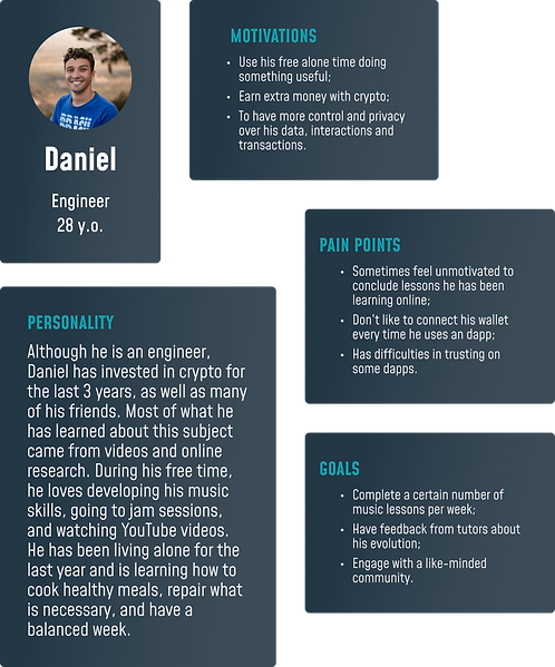
An Empathy Map was created to document the observations gathered during the researches 1 and 2. It was the starting point for creating personas and allowed the time to empathize with the user, guiding us to useful insights.

PERSONA 1
To stay aligned with our user-centered design approach, personas were developed based on surveys 1 and 2. The personas brought insights into creating parameters and kept us aligned with our user's needs.
“I’m always learning something online. From how to play a song, passing through how to fix something, to how to cook my favorite curry.”
INFORMATION ARCHITECTURE
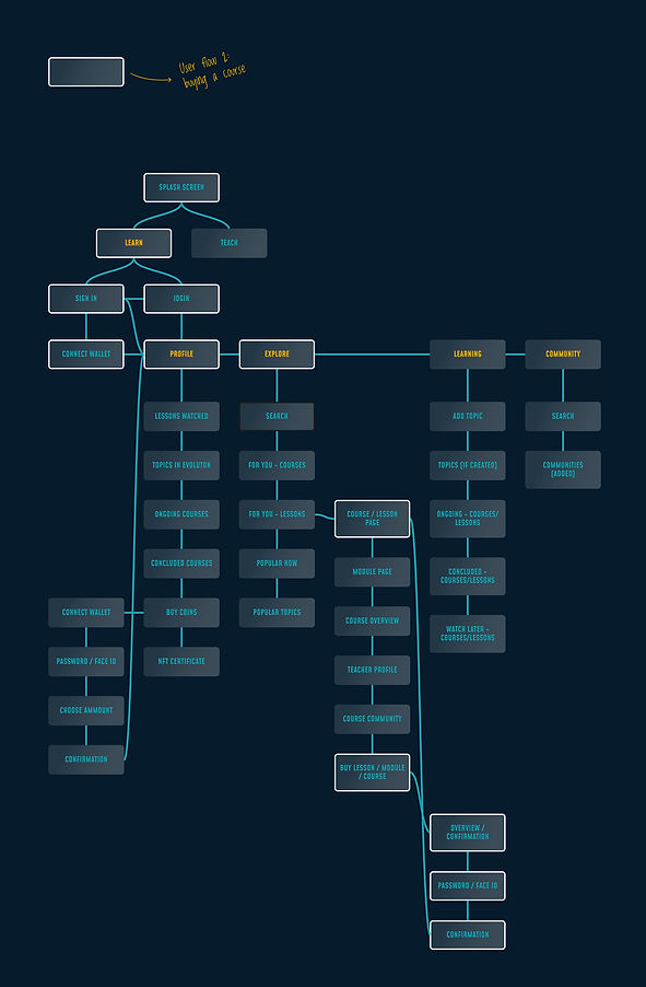
+ USER FLOW: Buying a Course
After aligning our initial product concept with the needs of our future users, I began developing the product further. Starting from the Information Architecture and delineating 3 user flows (one of them in white below).
4|Prototyping
(4/7)
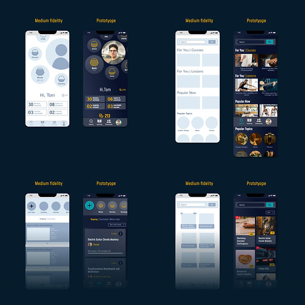
WIREFRAMES
Initially, medium-fidelity wireframes were developed. Then a prototype covering each of the 3 user flows was also developed. The prototype was user-tested later on.
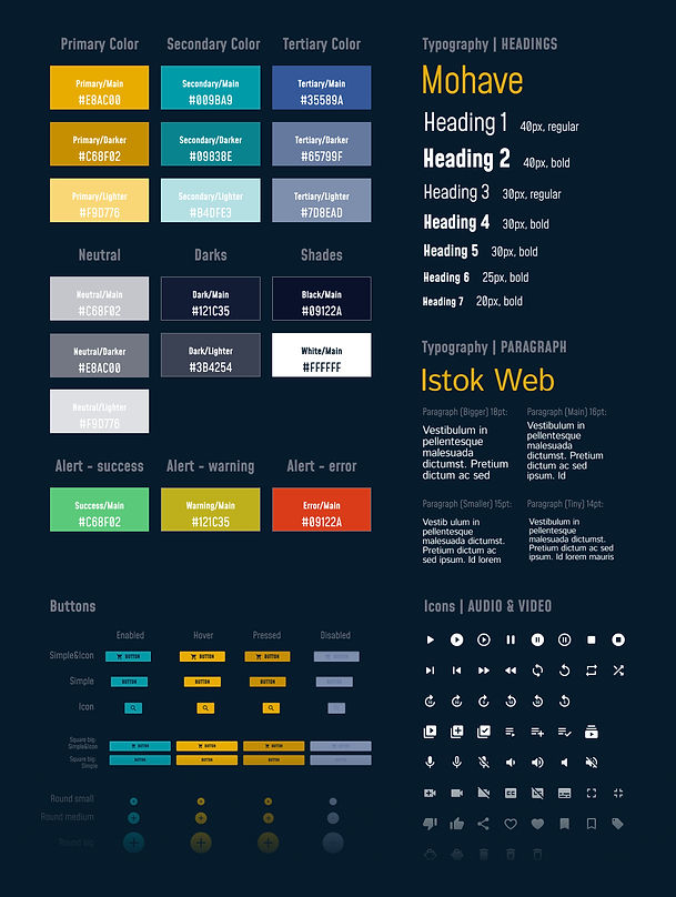
DESIGN SYSTEM
Find below part of the design system I developed for this project.
5|Research 3
(5/7)
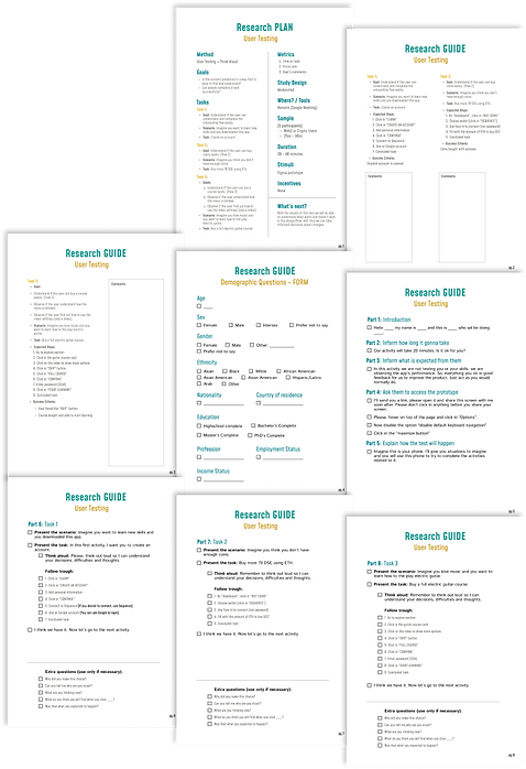
USABILITY TESTING
The test was crucial in ensuring that a product meets the user’s needs by identifying and addressing usability issues.
Method
Usability Test + Think Aloud Protocol
Goals
• Is the content presented in a way that is easy to find
and understand?
• Can people complete a task successfully?
Metrics
• Time on task
• Errors rate
• User’s comments
Sample (participants)
• 5 participants
• Web3 or Crypto Users
• 25 - 30 y.o.
Task 1
Task: Create an account.
Goal: Understand if the user can understand and complete the onboarding flow easily.
Scenario: Imagine you want to learn new skills and you downloaded this app.
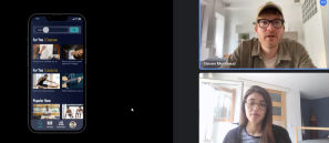
Task 2
Task: Buy more 70 DSE using ETH.
Goal: Understand if the user can buy coins easily. (flow 2)
Scenario: Imagine you think you don’t have enough coins.
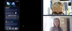
Task 3
Task: Buy more 70 DSE using ETH.
Goal:
• Understand if the user can buy a
course easily. (Flow 3)
• Observe if the user understands how the menu is divided.
• Observe if the user finds out
how to use the video settings
(skip a video).
Scenario: Imagine you think you don’t have enough coins.
Milena (researcher) during test with a participant
Milena (researcher) during test with a participant
RESULTS
» It is crucial that the 3rd user flow (task) be redesigned before development / launch.
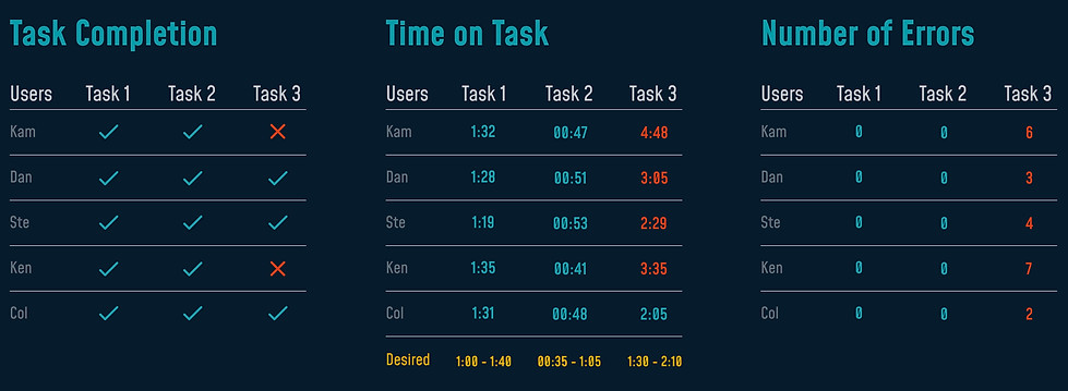
Participants had difficulty completing the 3rd task. The main difficulties were:
-
Find available courses using the menu: Some participants tried to click on the evolving topics wheel or had difficulty differentiating between "explore" and "learning".
-
Finding video navigation: participants took a while to understand how to activate video actions and, consequently, were unable to move on to the next video. Although they tried to click on the "modules" and the link to "overview of the course", which are acceptable paths, this was not the shortest and desired path.
“Learn everything from everyone? It’s very nice!”
“I’m not sure if I should go to
‘learning’ or ‘explore’. I wonder what is the difference. I’ll try ‘learning’ first. Ops, it’s not here.”
“Oh! That was it? I bought these tokens very quickly.”
6|Adjustments
(6/7)
FINDINGS AND ITERATION
By observing real users interact with the design, I could gather invaluable insights to refine and optimize the user experience, enhancing user satisfaction and usability before sending it to developers.

Change 1|BEFORE
Bottom Navigation
The participants were confused about what they would find in each destination of the bottom navigation.

Change 1|AFTER
Bottom Navigation
The destination hierarchy has been improved and the icon that leads to the dashboard/home has been changed from the avatar to the house icon. The search button was highlighted, since there is where the user explores the available courses and classes.

C3
C2
C3
C2
Change 2|BEFORE
Like or Watch Later?
Some participants commented about the “like” button referring to the heart icon when it is supposed to be a “watch later” button.
Like or Watch Later?
Some participants commented about the “like” button referring to the heart icon when it is supposed to be a “watch later” button.
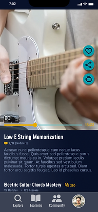
Change 3|BEFORE
Previous and Next Videos
Participants demonstrated great difficulty in finding the video command buttons, having difficulty kipping to the next one.
Change 2|AFTER
Like or Watch Later?
The icon was replaced with one more representative of the action it represents.
Change 3|AFTER
Previous and Next Videos
Now, the previous and next videos are displayed, giving users more control over their learning and enabling them to easily navigate through the lessons.
7|User Interface (UI)
(1/7)
Final Prototype

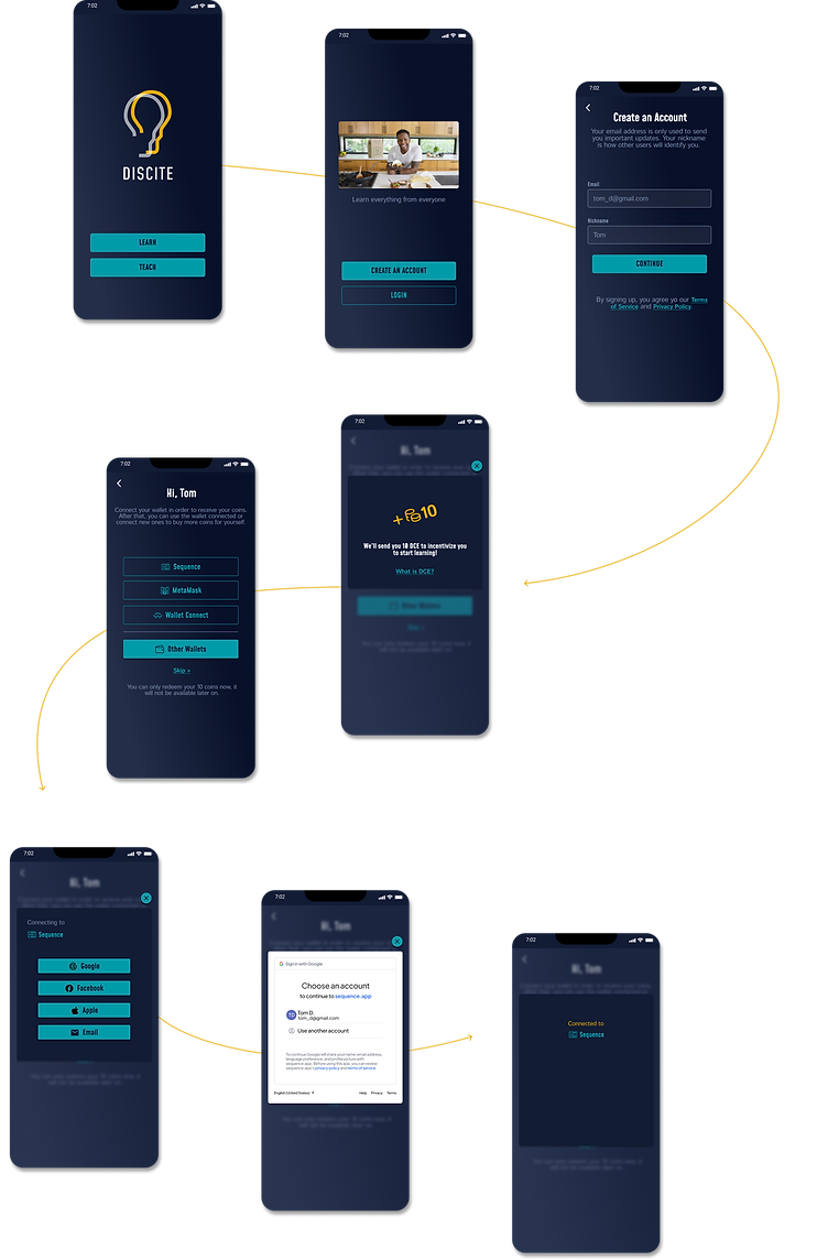
Onboarding
Users enter their email to receive updates and connect their crypto wallets
FLOW 1
Buying Coins
FLOW 2
Users easily exchange coins for the specific token used within the dapp

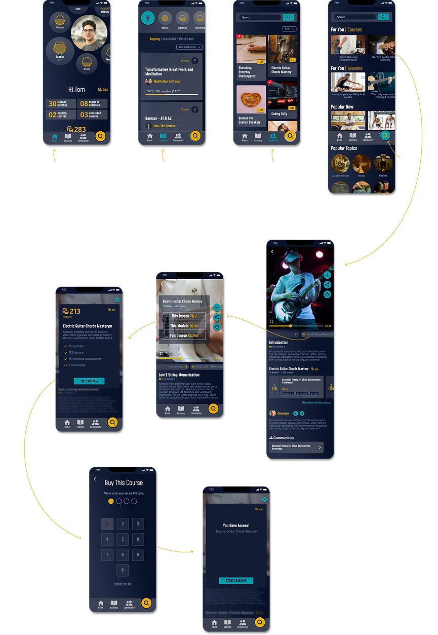
Buying a Course
Users explore available courses and classes, find out what's included and easily purchase using the wallet connected to the dapp.
FLOW 3